출처 : https://velopert.com/1712


이전부터 Sass 의 존재를 알고있었고,배우고싶었는데, 미뤄오셨나요? 그렇다면 잘 오셨습니다.
이 포스트에서는 Sass 의 특징에 대하여 알아보고, Sass 로 할 수 있는 멋진 것들을 알아볼테니까요.

Sass 가 뭐죠?

Sass (Syntactically Awesome Style Sheets : 문법적으로 멋진 스타일시트) 는 CSS pre-processor 로서, 복잡한 작업을 쉽게 할 수 있게 해주고, 코드의 재활용성을 높여줄 뿐 만 아니라, 코드의 가독성을 높여주어 유지보수를 쉽게해줍니다.

CSS pre-processor 란?

CSS 를 확장하는 스크립팅 언어로서, 컴파일러를 통하여 브라우저에서 사용 할 수 있는 일반 CSS 문법 형태로 변환합니다


어떻게 컴파일하죠?

SASS 를 컴파일하는방법은 여러가지가 있습니다:

  • 오리지널 Ruby Sass 사용하기
    gem install sass 로 설치하고,
    sass style.scss style.css 로 컴파일한다.
  • GUI 어플리케이션 사용하기 – Koala, Hammer, Compass
  • libsass 사용하기
    이는 C언어로 작성된 매우 빠른 Sass compiler 입니다.
    많은 환경에서 사용될 수 있습니다.

어떤걸 선택해야하냐구요? 여러분이 무엇을 만드는지, 어떤 환경에서 작업하는지에 따라 다릅니다.

저는 빠른 컴파일속도를 선호하고, Node.js 환경에서 작업을 하므로 node 환경에서 libsass 를 사용 할 수 있게 해주는 node-sass 를 사용합니다.

node-sass 사용하기

# NPM 을 통하여 node-sass 글로벌 설치
$ sudo npm install -g node-sass

# 컴파일하여 현재 디렉토리에 저장
$ node-sass style.scss -o .

# style.scss 파일에 변화가 있을 떄 마다 자동으로 리컴파일
$ node-sass style.scss -w -o .

성능 차이

이미지 2

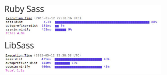
libsass 이 오리지널 Ruby Sass 에 비하여 훨씬 빠른 성능을 지니고 있습니다.

주의: libsass는 Ruby Sass 의 기능의 100% 를 지원하지는 않습니다 지금 시점으로는 모든 기능이 지원되기는 합니다.
허나, Ruby Sass 가 업데이트 되었을 때는, LibSass 역시 업데이트 될 때까지 기다려야합니다.
이에 대한 자세한 내용은 Sass Compatibility 를 참고하세요.

그냥 공부만 하거나, 예제를 만들어 공유하고싶은 분들께는 Sassmeister 를 사용하는것을 추천드립니다.
웹상에서 SASS 코드를 CSS 를 변화해주는 웹서비스이며, 예제를 만들어 공유 할 수도있습니다.


.SASS 와 .SCSS 의 차이는 뭐죠?

Sass 가 처음 릴리즈 되었을 때, 주 문법은 CSS와 많이 달랐습니다. 괄호 { } 대신 들여쓰기 (indentation) 을 사용하였으며 세미콜론 ; 을 사용하지 않고 단축 연산자를 사용하였습니다.

대략 다음과 같은 형태이지요.

=myclass // = means @ mixin
  font-size: 12px

p
  +myclass // + means @include

그 시절, 일부 개발자는 이 새로운 문법에 익숙하지 않아서, Sass 버전 3 이상부터는 주 문법이 .scss 로 변경되었습니다.
SCSS 는 CSS 의 상위집합으로서, CSS와 동일한 문법으로 SASS 의 특별한 기능들이 추가되어있습니다.

이 강좌에서는 .scss 문법을 사용하도록 하겠습니다. (오리지널 문법도 아직까지 지원되므로, 옛날 문법이 맘에 드시는분들은 그 문법을 사용해도 됩니다)


0. Comment (주석) 

Sass의 주석이 CSS 와 다른점은 한 줄 주석이 추가되었다는 점 입니다.

한 줄 주석은 // 로 표기하며,  CSS로 컴파일 되었을 때 나타나지 않습니다

여러 줄 주석은 CSS 와 동일하며 CSS 로 컴파일 되었을 때 나타납니다.

Sass

/* You can See me */

// You can't see me

/* You
   Can
   See
   Mee
*/

CSS

/* You can See me */
/* You
   Can
   See
   Mee
*/

1. Variable (변수)

Sass 는 CSS에 변수 개념을 도입해줍니다.

변수로 사용 가능한 형태는 숫자, 문자열, 폰트, 색상, null, listsmaps 가 있습니다.

변수를 사용 할 떄는 $ 문자를 사용합니다. 첫 변수를 한번 만들어볼까요?

Sass

$primary-color: #333;

CSS

변수를 만들어도, 사용하지 않으면 컴파일된 CSS 파일에는 아무것도 나타나지 않습니다.

한번 body 에서 사용을 해봅시다.

Sass

$primary-color: #333;

body {
  background-color: $primary-color;
}

CSS

body {
  background-color: #333;
}

Variable Scope (변수 범위)

Sass 의 변수엔 변수범위가 있습니다.  변수를 특정 selector (선택자) 에서 선언하면 해당 selector 에서만 접근이 가능합니다.

Sass

$primary-color: #333;

body {
  $primary-color: #eee;
  background-color: $primary-color;
}

p {
  color: $primary-color;
}

CSS

body {
  background-color: #eee;
}

p {
  color: #333;
}

변수를 선언 할 때, 변수를 global (전역) 하게 설정 할 때는 !global 플래그를 사용합니다.

Sass

$primary-color: #333;

body {
  $primary-color: #eee !global;;
  background-color: $primary-color;
}

p {
  color: $primary-color;
}

CSS

body {
  background-color: #eee;
}

p {
  color: #eee;
}

추가적으로, !default 플래그는 해당 변수가 설정되지 않았거나 값이 null 일떄 값을 설정합니다.

이 플래그는 나중에 mixin 을 작성 할 떄 유용하게 사용됩니다. (mixin 에 대한 설명은 강좌 하단부에 있습니다)

Sass

$primary-color: #333;

$primary-color: $eee !default;

p {
  color: $primary-color;
}

CSS

p {
  color: #333;
}

2. Math Operators (수학 연산자)

Sass 에서는 수학 연산자들을 사용 할 수 있습니다. 지원되는 연산자들은 다음과 같습니다:

Operator Description
+  addition
- subtraction
/ division
* multiplication
% modulo
== equality
!= inequality

주의하실점은, +, - operator 를 사용 할 떄는 단위를 언제나 통일시켜야합니다.

예를들어, 다음과 같은 코드는 오류가 발생하게됩니다: $box-width: 100% - 20px

이런 작업을 해야한다면 css 의 calc() 함수를 사용해야합니다.

다음과 같은 식은 오류 없이 작동합니다: $box-width: 300px / 960px * 100%

Sass

.container { width: 100%; }


article[role="main"] {
  float: left;
  width: 600px / 960px * 100%;
}

aside[role="complementary"] {
  float: right;
  width: 300px / 960px * 100%;
}

CSS

.container {
  width: 100%;
}

article[role="main"] {
  float: left;
  width: 62.5%;
}

aside[role="complementary"] {
  float: right;
  width: 31.25%;
}

3. Built-in Functions (내장함수)

이전에 여러분들이 CSS 작업을 하실 때, 멋진 버튼을 만드려고 컬러 팔레트 툴로 적절한 그림자 색깔을 찾으려고 노력한적이 있으신가요?

그런 여러분들께 darken() 함수를 소개합니다!
이 함수는 특정 색깔과, 얼마나 어둡게 할지 인수로 던져주면 자동으로 색상을 계산해서 나타내줍니다.
See the Pen <a href="http://codepen.io/velopert/pen/MewQvp/">MewQvp</a> by velopert (<a href="http://codepen.io/velopert">@velopert</a>) on <a href="http://codepen.io">CodePen</a>.<br />

(위 예제에서 사용된  & 문자에 대한 설명은 다음 섹션에서 설명됩니다)

이 함수 외에도, 많은 유용한 함수들이 엄청 많습니다. 모든 내장함수들의 목록은 여기서 확인 할 수 있습니다.

색깔에 관한 함수들의 보이는 예제는 Jackie Balzer 의 Visual Guide to Sass & Compass Color Functions 에서 확인 할 수 있습니다.


4. Nesting (중첩)

Sass 의 매우 유용한 기능중 하나는 선언을 중첩시킬 수 있다는 것 입니다. 어떻게 작동하는지, 또 어떤점을 주의해야 할 지 알아봅시다.

일반 CSS 에선 특정 선택자 안의 선택자를 스타일링 하려면 이렇게 했었죠?

/* CSS */
.container {
    width: 100%;
}

.container h1 {
    color: red;
}

간단한 CSS 면, 큰 문제는 없지만, CSS 파일이 커지면 유지보수가 어려워지죠..

Sass 에선, 이런식으로 작성하면 위와 같은 결과물을 얻을 수 있게 됩니다!

/* Sass */
.container {
    width: 100%;
    h1 {
        color: red;
    }
}

부모 선택자를 리퍼런스 할떄는 & 문자를 사용합니다. (내장함수 예제에서도 이 문자가 사용됐었죠?)

Sass

a {
  color: black;
  &:hover {
    text-decoration: underline;
    color: gray;
  }
  &:visited {
    color: purple;
  }
}

CSS

a {
  color: black;
}
a:hover {
  text-decoration: underline;
  color: gray;
}
a:visited {
  color: purple;
}

코드 중첩을 하는건 위와같이 하면 됩니다. 하지만 중첩에서 벗어나려면 (de-nest) 어떻게 할까요? 예를들어.. 다음과 같은 코드가 있을 때

/* Sass */
.container {
  .child {
    color: blue;
  }
  .sibling {
    color: gray;
  }
}

sibling 클래스가 container 클래스 밖에서도 사용되는것을 알게되었을땐, @at-root directive (지시자) 를 사용합니다.

Sass

.container {
  .child {
    color: blue;
  }
  @at-root .sibling {
    color: gray;
  }
}

CSS

.container .child {
  color: blue;
}
.sibling {
  color: gray;
}

위는 그냥 사실 사용 예제일 뿐이고 사실상 이런 상황이 오면 코드를 잘라내서 밖에 붙여넣는게 맞죠.

보통 @at-root 는 Sass 코드를 깔끔하게 정리하면서 작성 할 때 사용됩니다 (참조링크: Writing modular CSS (BEM/OOCSS) selectors with Sass 3.3)

인셉션 규칙: Sass 코드 중첩을 할 때, 4 레벨 보다 깊게 들어가지 말 것

영화 인셉션에서 보면, 레벨 5의 꿈을 꾸게 될 땐 림보에 빠져서 개고생하게되죠..
더 깊게 들어간다고해서 오류가 나거나 Sass 개발자가 화를 내지는 않겠지만.. 코드가 복잡해질 확률이 높고 유지보수가 어려워집니다.
자세한 내용은 제목부분의 링크를 클릭하여 참조하세요.


5. Import (불러오기) 

import 기능은 스타일들을 여러 파일들로 나누고, 다른 파일에서 불러와서 사용하는 기능입니다.

다음과 같이 @import directive 를 사용하여 특정.scss 파일을 불러 올 수 있습니다:

@import "layout.scss";

참고로, 확장자를 붙이지 않아도 됩니다.

@import "layout";

partial

partial 기능에 대하여 알아봅시다.

만약에 .sass 파일이나 .scss 파일의 파일이름을 underscore _ 로 시작하면 css 파일로 따로 컴파일되지 않습니다.

html 에서 해당 css 파일을 불러올일이 없고, import 만 되는경우에는이 기능을 사용하세요.


6. Extend (상속) 

Sass 에서 특정 선택자를 상속 할 때, @extend directive를 사용합니다.

Sass

.box {
  border: 1px solid gray;
  padding: 10px;
  display: inline-block;
}

.success-box {
  @extend .box;
  border: 1px solid green;
}

CSS

.box, .success-box {
  border: 1px solid gray;
  padding: 10px;
  display: inline-block;
}

.success-box {
  border: 1px solid green;
}

Placeholder

Placeholder 선택자 % 를 사용하면 상속은 할 수 있지만 해당 선택자는 컴파일되지 않습니다.

Sass

%box {
  padding: 0.5em;

}

.success-box {
  @extend %box;
  color: green;
}

.error-box {
  @extend %box;
  color: red;
}

CSS

.success-box, .error-box {
  padding: 0.5em;
}

.success-box {
  color: green;
}

.error-box {
  color: red;
}

7. Mixin (믹스인)

Mixin 은 Sass 의 아주 유용한 기능 중 하나인데요, extend 와 비슷하지만 argument (인수) 를 받을 수 있습니다.

mixin 을 선언 할 떄는 @mixin directive 를 사용하며, 이를 사용 할 때는 @include directive 를 사용합니다.

Sass

@mixin headline ($color, $size) {
  color: $color;
  font-size: $size;
}

h1 {
  @include headline(green, 12px);
}

CSS

h1 {
  color: green;
  font-size: 12px;
}

Mixin 을 응용하면 이런식으로도 사용 가능합니다:

Sass

@mixin media($queryString){
    @media #{$queryString} {
      @content;
    }
}

.container {
    width: 900px;
    @include media("(max-width: 767px)"){
        width: 100%;
    }
}

CSS

.container {
  width: 900px;
}
@media (max-width: 767px) {
  .container {
    width: 100%;
  }
}

워우워우… 갑자기 처음보는 표현들이 좀 나왔죠? 당황하지 마세요, 설명해드리겠습니다.

#{ } 표현은 특정 문자열을 따로 처리하지않고 그대로 출력 할 때 사용됩니다.

@content directive 를 사용하면 나중에 @include 하였을 때, 그 선택자 내부의 내용들이 @conent 부분에 나타나게됩니다.


8. Function (함수)

Built-in Function 과는 달리 이부분은 임의 함수입니다.

Function은 위에서 소개한 mixin 과도 사뭇 비슷한데요, 차이점은 mixin 은 style markup 을 반환하지만,  function 은 @return directive 를 통하여 을 반환합니다.

Function을 선언 할 때는,  예상하셨겠지만! @function directive 를 사용합니다.

Sass

@function calc-percent($target, $container) {
  @return ($target / $container) * 100%;
}

@function cp($target, $container) {
  @return calc-percent($target, $container);
}

.my-module {
  width: calc-percent(650px, 1000px);
}

CSS

.my-module {
  width: 65%;
}

꿀 팁: 자주 사용 할 것 같은 함수는 위와같이 단축함수를 만들어 사용하세요. 그런다고해서 결과물의 용량이 늘어나지는 않으니까요.


마치면서

여기까지 다 읽으셨다면 Sass 에 대해 어느정도 배운 것 같다.. 고 생각 하실 수 있지만, 그건 큰 오산입니다! Sass 의 기본적인 기능에 대하여 대부분 소개한건 사실 이지만 이 강좌에서 다룬건 그저 빙산의 일각에 불과합니다. 왜, 그렇잖아요. CSS 도 속성 하나하나만 따지면 그렇게 대단 한 것도 아닌데 여러가지 속성들이 합쳐지면 엄청나게 멋진 UI를 만드는 것 처럼요.

Sass 에 대하여 더 배우고 싶으신 분들께 다음 링크를 추천해드리겠습니다.

그럼, 즐거운 Sassing 되세요 🙂

Refrences

  1. “Sass Basics”. Sass.
  2. “Getting Started With Sass”. Scotch.io
  3. The Sass Ampersand”CSS-Tricks.
  4. “The Inception Rule”. The Sass Way.
  5. “Understanding placeholder selector”. The Sass Way.
  6. “Sass Basics: The Mixin Directive”. SitePoint
  7. “Pure Sass Functions”. The Sass Way.


참고 : https://developer.mozilla.org/ko/docs/Web/Guide/CSS/Using_CSS_transitions


* 예제

transition:border-color .4s,box-shadow .4s,background .4s,color .4s,opacity .4s 


Normalize : http://necolas.github.io/normalize.css/

Normalize.css 소개

Normalize.css는 HTML 요소의 기본 스타일을 브라우저 간 일관성을 유지하도록 돕는 CSS 파일이다. 이것은 Boilerplate(보일러플레이트) 및 Bootstrap(부트스트랩) 등과 같은 크고 작은 프로젝트에서도 두루두루 사용되고 있다.


Normalize.css 특징

브라우저(모바일 브라우저를 포함하여)를 광범위하게 지원하며, HTML5 요소, 타이포그래피, 목록(lists), embeded 콘텐츠, 폼과 테이블을 일관성있게 통일시키는 CSS를 포함한다.

    다른 CSS reset 과는 달리 사용하기 좋은 기본값들은 유지한다.
    HTML 요소의 다양한 스타일을 정규화한다.
    버그 및 브라우저 간 차이점을 수정한다.
    부분적인 개선과 가용성을 향상시킨다.
    코드에 대한 자세한 주석이 달려 이해를 돕는다.
    normalize는 버전 1은 구형 IE(IE6)를 지원하지만 더이상 개발이나 수정이 이루어지지 않는다. 버전 3대가 현재 개발되고 애용되는 버전이다.

@charset "UTF-8";

/* base */
html {line-height: 1.15; -webkit-text-size-adjust: 100%;}
body {margin: 0;}
main {display: block;}
h1 {font-size: 2em; margin: 0.67em 0;}
hr {box-sizing: content-box; height: 0; overflow: visible;}
pre {font-family: monospace, monospace; font-size: 1em;}
a {background-color: transparent;}
abbr[title] {border-bottom: none; text-decoration: underline; text-decoration: underline dotted;}
b, strong {font-weight: bolder;}
code, kbd, samp {font-family: monospace, monospace; font-size: 1em;}
small {font-size: 80%;}
sub, sup {font-size: 75%; line-height: 0; position: relative; vertical-align: baseline;}
sub {bottom: -0.25em;}
sup {top: -0.5em;}
img {border-style: none;}
button, input, optgroup, select, textarea {font-family: inherit; font-size: 100%; line-height: 1.15; margin: 0;}
button, input {overflow: visible;}
button, select {text-transform: none;}
button, [type="button"], [type="reset"], [type="submit"] {-webkit-appearance: button;}
button::-moz-focus-inner, [type="button"]::-moz-focus-inner, [type="reset"]::-moz-focus-inner, [type="submit"]::-moz-focus-inner {border-style: none; padding: 0;}
button:-moz-focusring, [type="button"]:-moz-focusring, [type="reset"]:-moz-focusring, [type="submit"]:-moz-focusring {outline: 1px dotted ButtonText;}
fieldset {padding: 0.35em 0.75em 0.625em;}
legend {box-sizing: border-box; color: inherit; display: table; max-width: 100%; padding: 0; white-space: normal;}
progress {vertical-align: baseline;}
textarea {overflow: auto;}
[type="checkbox"], [type="radio"] {box-sizing: border-box; padding: 0;}
[type="number"]::-webkit-inner-spin-button, [type="number"]::-webkit-outer-spin-button {height: auto;}
[type="search"] {-webkit-appearance: textfield; outline-offset: -2px;}
[type="search"]::-webkit-search-decoration {-webkit-appearance: none;}
::-webkit-file-upload-button {-webkit-appearance: button; font: inherit;}
details {display: block;}
summary {display: list-item;}
template {display: none;}
[hidden] {display: none;}

/* base extend */
ol, ul {list-style: none;}
blockquote, q {quotes: none;}
blockquote:before, blockquote:after, q:before, q:after {content: ''; content: none;}
table {border-collapse: collapse; border-spacing: 0;}
a {text-decoration: none;}
caption {display: none;}
* {-webkit-box-sizing: border-box; -moz-box-sizing: border-box; box-sizing:border-box;}
*:before, *:after {-webkit-box-sizing: border-box; -moz-box-sizing: border-box; box-sizing:border-box;}


=================================================================================================================================


참고 : http://www.cssreset.com/


@charset "UTF-8";
html,body,div,span,applet,object,iframe,h1,h2,h3,h4,h5,h6,p,blockquote,pre,a,abbr,acronym,address,big,cite,code,del,dfn,em,img,ins,kbd,q,s,samp,small,strike,strong,sub,sup,
tt,var,b,u,i,center,dl,dt,dd,ol,ul,li,fieldset,form,label,legend,table,caption,tbody,tfoot,thead,tr,th,td,article,aside,canvas,details,embed,figure,figcaption,footer,header,hgroup,menu,
nav,output,ruby,section,summary,time,mark,audio,video{margin:0;padding:0;border:0;font-size:100%;font:inherit;vertical-align:baseline;}
/*HTML5display-roleresetforolderbrowsers*/
article,aside,details,figcaption,figure,footer,header,hgroup,menu,nav,section{display:block;}
body{line-height:1;}
ol,ul{list-style:none;}
blockquote,q{quotes:none;}
blockquote:before,blockquote:after,q:before,q:after{content:'';content:none;}
table{border-collapse:collapse;border-spacing:0;}
button{font-size:100%;font-family:inherit;margin:0;width:auto;overflow:visible;} /* width, overflow는 ie7 버그 */
button::-moz-focus-inner{border:0;padding:0;} /* firefox bug */


참고 : http://stackoverflow.com/questions/210717/using-jquery-to-center-a-div-on-the-screen


- scroll 계산 없이 처리

(function($){
    $.fn.extend({
        center: function () {
            return this.each(function() {
                var top = ($(window).height() - $(this).outerHeight()) / 2;
                var left = ($(window).width() - $(this).outerWidth()) / 2;
                $(this).css({position:'absolute', margin:0, top: (top > 0 ? top : 0)+'px', left: (left > 0 ? left : 0)+'px'});
            });
        }
    }); 
})(jQuery);

- scroll 계산 포함

(function($){
     $.fn.extend({
          center: function (options) {
               var options =  $.extend({ // Default values
                    inside:window, // element, center into window
                    transition: 0, // millisecond, transition time
                    minX:0, // pixel, minimum left element value
                    minY:0, // pixel, minimum top element value
                    withScrolling:true, // booleen, take care of the scrollbar (scrollTop)
                    vertical:true, // booleen, center vertical
                    horizontal:true // booleen, center horizontal
               }, options);
               return this.each(function() {
                    var props = {position:'absolute'};
                    if (options.vertical) {
                         var top = ($(options.inside).height() - $(this).outerHeight()) / 2;
                         if (options.withScrolling) top += $(options.inside).scrollTop() || 0;
                         top = (top > options.minY ? top : options.minY);
                         $.extend(props, {top: top+'px'});
                    }
                    if (options.horizontal) {
                          var left = ($(options.inside).width() - $(this).outerWidth()) / 2;
                          if (options.withScrolling) left += $(options.inside).scrollLeft() || 0;
                          left = (left > options.minX ? left : options.minX);
                          $.extend(props, {left: left+'px'});
                    }
                    if (options.transition > 0) $(this).animate(props, options.transition);
                    else $(this).css(props);
                    return $(this);
               });
          }
     });
})(jQuery);
$(document).ready(function(){
    $('#mainDiv').center();
    $(window).bind('resize', function() {
        $('#mainDiv').center({transition:300});
    });
);


$('your-selector').position({
    of: $(window)
});


$.fn.center = function() {
    this.css({
        'position': 'fixed',
        'left': '50%',
        'top': '50%'
    });
    this.css({
        'margin-left': -this.outerWidth() / 2 + 'px',
        'margin-top': -this.outerHeight() / 2 + 'px'
    });

    return this;
}


jQuery.fn.center = function ($) {
  var w = $(window);
  this.css({
    'position':'absolute',
    'top':Math.abs(((w.height() - this.outerHeight()) / 2) + w.scrollTop()),
    'left':Math.abs(((w.width() - this.outerWidth()) / 2) + w.scrollLeft())
  });
  return this;
}
.center{
    position: absolute;
    height: 50px;
    width: 50px;
    background:red;
    top:calc(50% - 50px/2);   /* 50% - height/2 */
    left:calc(50% - 50px/2);  /* 50% - width/2 */
}


==========================================================================================================

Bootstrap Modal Center 띄우기

참고 : http://codepen.io/dimbslmh/full/mKfCc


button::-moz-focus-inner,
input[type=reset]::-moz-focus-inner,
input[type=button]::-moz-focus-inner,
input[type=submit]::-moz-focus-inner,
input[type=file]>input[type=button]::-moz-focus-inner{padding:0; border:0}

반응형 웹 관련

http://helloworld.naver.com/helloworld/81480


Responsive 웹 디자인이 적용된 사이트가 정리된 곳

http://mediaqueri.es/

디바이스별 미디어 쿼리 정리

속성으로 구분

  • 스마트폰 (가로/세로):
    @media only screen and (min-device-width : 320px) and (max-device-width : 480px) {
    /* Styles */
    }
  • 스마트폰 (가로):
    @media only screen and (min-width : 321px) {
    /* Styles */
    }
  • 스마트폰 (세로):
    @media only screen and (max-width : 320px) {
    /* Styles */
    }
  • iPad (가로/세로):
    @media only screen and (min-device-width : 768px) and (max-device-width : 1024px) {
    /* Styles */
    }
  • iPad (가로):
    @media only screen and (min-device-width : 768px) and (max-device-width : 1024px) and (orientation : landscape) {
    /* Styles */
    }
  • iPad (세로):
    @media only screen and (min-device-width : 768px) and (max-device-width : 1024px) and (orientation : portrait) {
    /* Styles */
    }
  • 데스크탑 브라우저 (가로):
    @media only screen and (min-width : 1224px) {
    /* Styles */
    }
  • 큰 모니터:
    @media only screen and (min-width : 1824px) {
    /* Styles */
    }
  • iPhone4와 같은 높은 해상도:
    @media only screen and (-webkit-min-device-pixel-ratio : 1.5), only screen and (min-device-pixel-ratio : 1.5) {
    /* Styles */
    }

파일로 구분

  • 스마트폰 (가로/세로):
    <link rel="stylesheet" href="smartphone.css"
    media="only screen and (min-device-width : 320px) and (max-device-width : 480px)">
  • 스마트폰 (가로):
    <link rel="stylesheet" href="smartphone-landscape.css"
    media="only screen and (min-width : 321px)">
  • 스마트폰 (세로):
    <link rel="stylesheet" href="smartphone-portrait.css"
    media="only screen and (max-width : 320px)">
  • iPad (가로/세로):
    <link rel="stylesheet" href="ipad.css"
    media="only screen and (min-device-width : 768px) and (max-device-width : 1024px)">
  • iPad (가로):
    <link rel="stylesheet" href="ipad-landscape.css"
    media="only screen and (min-device-width : 768px) and (max-device-width : 1024px) and (orientation : landscape)">
  • iPad (세로):
    <link rel="stylesheet" href="ipad-portrait.css"
    media="only screen and (min-device-width : 768px) and (max-device-width : 1024px) and (orientation : portrait)">
  • 데스크탑 브라우저 (가로):
    <link rel="stylesheet" href="widescreen.css"
    media="only screen and (min-width : 1224px)">
  • 큰 모니터:
    <link rel="stylesheet" href="widescreen.css"
    media="only screen and (min-width : 1824px)">
  • iPhone4와 같은 높은 해상도:
    <link rel="stylesheet" href="iphone4.css"
    media="only screen and (-webkit-min-device-pixel-ratio : 1.5), only screen and (min-device-pixel-ratio : 1.5)">

출처: http://www.stuffandnonsense.co.uk/blog/about/hardboiled_css3_media_queries/

출처 : http://naradesign.net/wp/2008/05/27/144


float을 clear하는 4가지 방법.

본문 건너 뛰기

CSS 속성 가운데 float 속성은 자기 자신의 위치를 주변의 콘텐츠로부터 상대적으로 배치하는 속성입니다. float은 사전적 의미로 ‘뜨다, 띄우다, 뜨는 물건, 부유물’ 이라는 의미가 담겨져 있습니다. float은 높이가 가변적인 다단 컬럼 형태의 CSS 레이아웃을 위하여 반드시 요구되는 속성으로서 처음 CSS 배치기법을 익힐 때 가장 이해하기 어려운 속성중의 하나 입니다. float 속성이 부여된 엘리먼트는 좌측이나 우측으로 배치되면서 주변 콘텐츠의 배치에도 영향을 미친다는 사실은 어렵지 않게 학습되나 ‘float 된 엘리먼트가 부모 엘리먼트의 높이에 영향을 주지 않는다는 사실’은 몇 번의 경험 또는 선배들의 조언으로 깨닫게 되는 것이지요.

오늘은 float 속성을 이해하고 다단 컬럼형 레이아웃을 시도할 때 주변 엘리먼트들이 원하는 상태로 배치될 수 있도록 이것에 대응하거나 clear 하는 방법에 대하여 공유하고자 합니다. clear 속성은 float이 더이상 주변 엘리먼트의 배치에 영향을 미치지 않도록 해제시키는 속성입니다. 만약 Internet Explorer 브라우저를 사용하여 학습을 시도하신다면 일단 멈추시고 표준계열 브라우저에서 먼저 시도해 보세요. CSS 표준 렌더링을 엄격하게 준수하는 Opera와 Safari를 권장합니다. Internet Explorer와 Firefox 브라우저는 float, clear 속성에 관한 버그를 포함하고 있으므로 float과 clear의 표준 렌더링이 어떻게 구현되는지를 학습할 때 도움이 되지 않습니다. 하지만 버그를 해결하는 방법도 소개되어 있으니 안심하세요.

오늘 글의 핵심은 ‘float된 자식 엘리먼트의 높이를 부모 엘리먼트에 반영하도록 대응하는 방법’ 이라고 한마디로 설명할 수 있겠습니다. 부모 떠난 자식을 다시 부모의 품 안으로 돌아오도록 하려면 어떻게 해야 하는지 한번 살펴 보시죠.

float에 아무런 대응도 하지 않은 상태

#container는 부모 엘리먼트이며 #lnb와 #content는 자식 엘리먼트로서 현재 float된 상태 입니다. 아래 예제는 float에 아무런 대응을 하지 않으면 자식 엘리먼트가 부모 엘리먼트의 높이에 영향을 주지 않는다는 사실을 보여주고 있습니다. #container의 높이가 자식 엘리먼트의 높이를 반영하지 않고 있다는 사실에 주목해 주세요. float에 아무런 대응도 하지 않은 상태의 예제가 준비되어 있습니다.

float에 아무런 대응도 하지 않은 상태의 예제

float에 float으로 대응하는 방법

자식 엘리먼트의 높이를 부모에게 반영하는 방법으로 부모에게도 float 속성을 부여하는 방법이 있습니다. 부모에게 float 속성을 부여하게 되면 부모엘리먼트는 자식 엘리먼트의 높이를 반영합니다. 하지만 부모 엘리먼트의 너비는 float된 두 자식의 너비를 담을만큼만 작게 줄어든다는 사실에 주목해 주세요. 부모의 너비가 브라우저 크기에 따라 가변적이어야 하는 경우에 적용하기 어려운 단점이 있습니다. 또한 조상 엘리먼트들이 겹겹이 존재하는 경우 자식의 높이를 조상 엘리먼트에게 각각 전달하기 위하여 조상 엘리먼트들을 모두 float 시켜야 하므로 일반적으로 사용하는것을 권장하지 않습니다. float에 float으로 대응하는 방법 예제.

float에 float으로 대응하는 방법 예제

float에 overflow 속성으로 대응하는 방법

자식 엘리먼트의 높이를 부모에게 반영하는 방법으로 부모 엘리먼트에 overflow:auto 또는 overflow:hidden 속성을 부여하는 방법이 있습니다. overflow:auto 속성은 자식의 너비가 가변적이고 부모의 너비보다 커지는 상황이 발생할 때 가로 스크롤바를 유발하기 때문에 일반적으로 권장하는 방식이 아닙니다. overflow:hidden 속성은 그러한 상황에서 가로 스크롤바를 유발하지는 않지만 자식의 너비가 넘치는 경우 넘치는 부분이 잘리기 때문에 이 역시 완전하게 안전한 방법은 아닙니다. float에 overflow 속성으로 대응하는 방법 예제.

float에 overflow 속성으로 대응하는 방법

float을 빈 엘리먼트로 clear 하는 방법

이 방법은 #container 영역이 끝나기 직전 빈 엘리먼트를 넣고 빈 엘리먼트에 clear:both 속성을 부여하여 부모가 자식의 높이를 인식하도록 하는 방법입니다. 하지만 의미 없는 빈 엘리먼트를 사용하기 때문에 이 역시 권장되는 방법은 아닙니다. float을 빈 엘리먼트로 clear 하는 방법 예제. 예제에서는 .clear 라는 빈 엘리먼트를 가시적으로 보이도록 하였지만 실무에서는 보통 .clear {clear:both; height:0; overflow:hidden;} 처리하여 .clear 라는 빈 엘리먼트가 스스로 높이를 갖지 않도록 하고 보이지 않도록 처리 합니다.

float을 빈 엘리먼트로 clear 하는 방법 예제

float을 가상 선택자 :after로 clear 하는 방법

가장 탁월하다고 생각하는 방법 입니다. 우선 ‘가상 선택자‘라는 개념을 이해하셔야 하기 때문에 약간 상세히 설명드리겠습니다. 여러분들이 익히 알고 계시는 :link, :visited:hover, :active, :focus는 모두 가상 선택자 입니다. ‘가상 선택자’는 다시 ‘가상 클래스‘와 ‘가상 엘리먼트‘로 구분할 수 있는데요. ‘가상 클래스‘는 특정 엘리먼트에 대하여 아무런 class를 부여하지 않았지만 마치 역동적으로 class를 변경한것과 같은 효과를 낼 수 있는 것들로서 이미 존재하는 엘리먼트에 조합해서 사용할 수 있습니다.  :link, :visited:hover, :active, :focus:first-child가 가상 클래스에 해당됩니다. 한편 ‘가상 엘리먼트‘란, 존재하지 않는 엘리먼트를 가상으로 생성해내는 선택자로서 :first-line:first-letter:before, :after가 있습니다. 심지어 :before와 :after는 HTML문서상에 존재하지 않는 콘텐츠를 출력시키기도 합니다.  Hello World Collection이라는 웹 사이트에 신현석님이 ‘Hello World’라는 메시지를 어떻게 출력했는지 살펴보시면 재미있고 이해하기도 쉽죠. 이렇게 가상의 엘리먼트를 생성 #container:after {content:" "} 시킨 다음 display:block; clear:both 처리를 추가하게 되면 의미 없는 빈 엘리먼트를 사용하지 않으면서도 가상 엘리먼트를 이용하여 깔끔하게 float이 clear됩니다. float을 가상 선택자 :after로 clear 하는 방법 예제.

float을 가상선택자 :after로 clear 하는 방법 예제

상기 예제로부터 가상 엘리먼트가 스스로 높이를 갖지 않고 화면에 보이지 않도록 처리 하려면 아래와 같이 처리 합니다.

#container:after {content:""; display:block; clear:both;}

하지만 Internet Explorer는 :before, :after 가상 엘리먼트 선택자를 지원하지 않기 때문에 다음과 같은 Hack이 필요합니다. 

#container {*zoom:1;} /* IE5.5~7 브라우저 대응 Hack */
#container:after {content:" "; display:block; clear:both;} /* 표준계열 브라우저에 대응하는 float 해제용 가상 엘리먼트의 생성 */

IE 5~7 브라우저는 hasLayout이라는 고유한 성질을 갖게 되면 float을 해제하는 트리거로 작용하는 성질이 있고 zoom:1 속성이 hayLayout 이라는 성질을 갖도록 하기 때문에 IE 5~7 브라우저 고유의 특징을 이용한 해결방법 입니다.

float을 display:inline-block 으로 clear 하는 방법

float된 자식요소들의 높이를 부모에게 전달하는 방법으로써 부모 요소에 display:inline-block 속성을 부여하는 방법도 있습니다. [코멘트 해주신 김영환님 감사합니다] inline-block 속성이 부여된 요소는float된 자식의 높이만큼 늘어납니다. [CSS 2.1 관련 설명 코멘트 해주신 연홍석님 감사합니다] 모든 브라우저가 동일하게 float을 해제하는 방향으로 작용합니다. 단, 표준계열 브라우저들은 부모 요소의 너비가 자식의 너비만큼 알맞게 줄어들지만 IE 6~7 브라우저는 100%의 너비를 갖게 되는 특징이 있습니다. 또한 inline-block 속성을 갖게 된 요소는 인라인 요소와 마찬가지로 박스가 끝나는 지점에 약 4px 정도의 공백을 갖게 되므로 이점 유념하시는게 좋겠습니다. 

참조


출처 : http://stackoverflow.com/questions/1150163/stretch-and-scale-a-css-image-in-the-background-with-css-only


 html {
    background: url(images/homeBg.jpg) no-repeat center center fixed;
    webkit-background-size: cover;
    moz-background-size: cover;
    o-background-size: cover;
    background-size: cover;
    filter: progid:DXImageTransform.Microsoft.AlphaImageLoader(src='images/homeBg.jpg',     sizingMethod='scale');
    -ms-filter: progid:DXImageTransform.Microsoft.AlphaImageLoader(src='images/homeBg', sizingMethod='scale');
}


+ Recent posts